
Canvas by Instructure
Student insights for teachers.
- Role
- Design Lead
- Timeline
- 2019 – 2020
- Team
- Katrina Hess, Justin Boyer
- Platform
- Web
01
The problem
Canvas tracks a huge amount of data about how students use it. Unless a school has a dedicated data analyst, almost none of it is ever seen.
Meanwhile, teachers and counselors often don't realize a student is struggling until a grade makes it obvious, and by then it's often too late to help.
02
Process
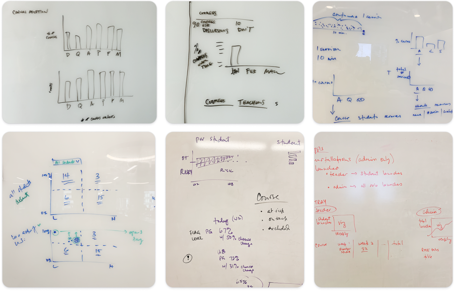
Finding the right level of detail. Our first idea was a class-wide snapshot. It was an easy first step for the data science and machine learning teams, but teachers of large lecture courses found it overwhelming. A snapshot told them something was wrong without telling them what to do. We pushed for insights that were more complex and more actionable.
Choosing the insights. With the data science and machine learning teams, we narrowed in on six insights teachers genuinely cared about. The model showed that not accessing the course and not participating in learning activities were among the strongest signals of failing a class. “Showed decline,” a combination of several factors, mattered just as much.
Balancing the tone. Those warning signs were essential, but a dashboard full of problems is one nobody wants to open. I insisted on an equal number of positive insights so teachers would want to come back to it. That gave us three of each:
Needs attention: didn't access course, didn't participate, showed decline.
Going well: showed improvement, moved to “on track to pass,” overall “on track to pass.”
03
Solution
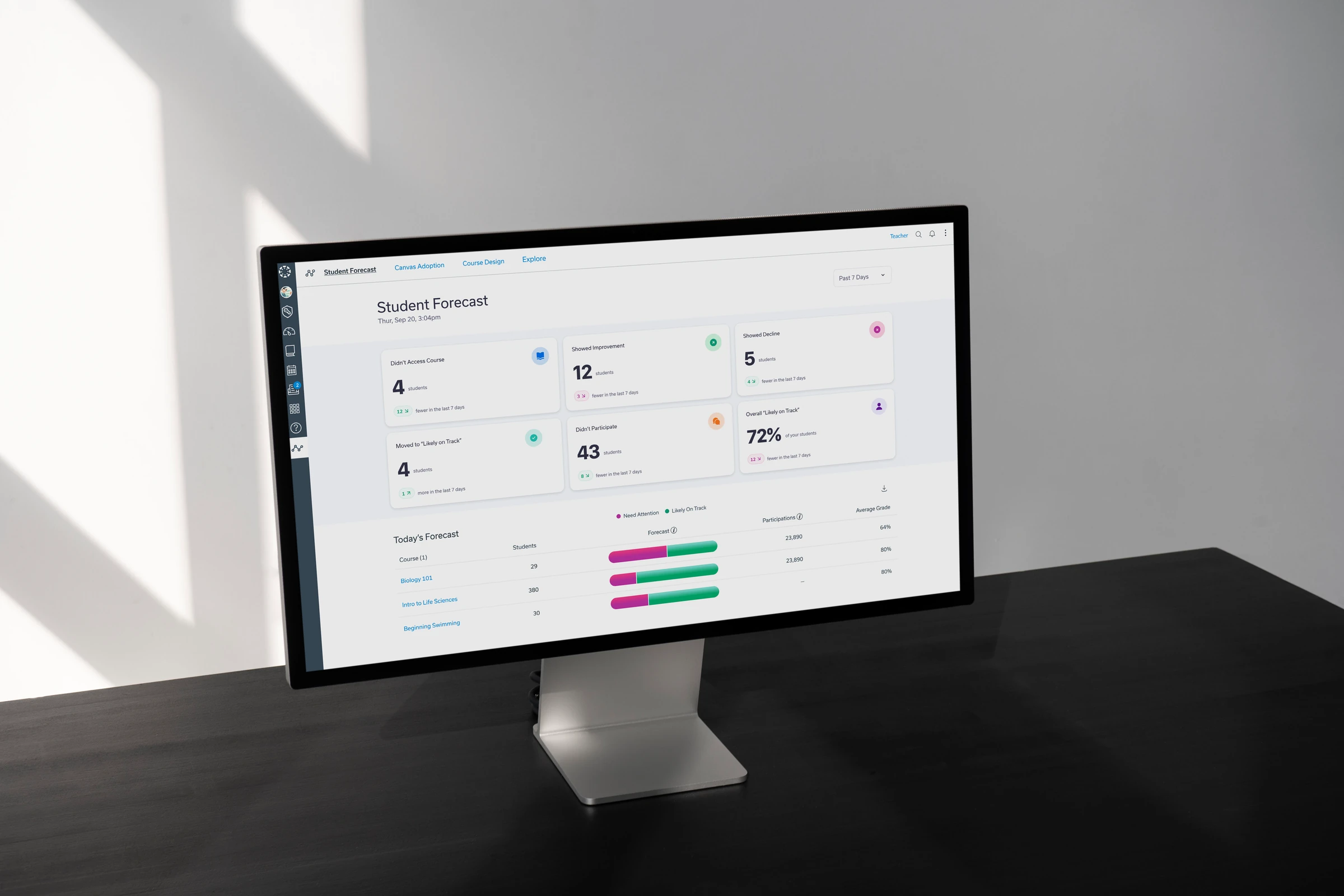
The forecast. Each insight appears as a card showing how many students it applies to and how that number changed over the past week. That way, teachers see movement as well as a snapshot.
Today's Forecast. Below the cards, each course shows the balance of students who need attention versus those likely on track, alongside participation and average grade.
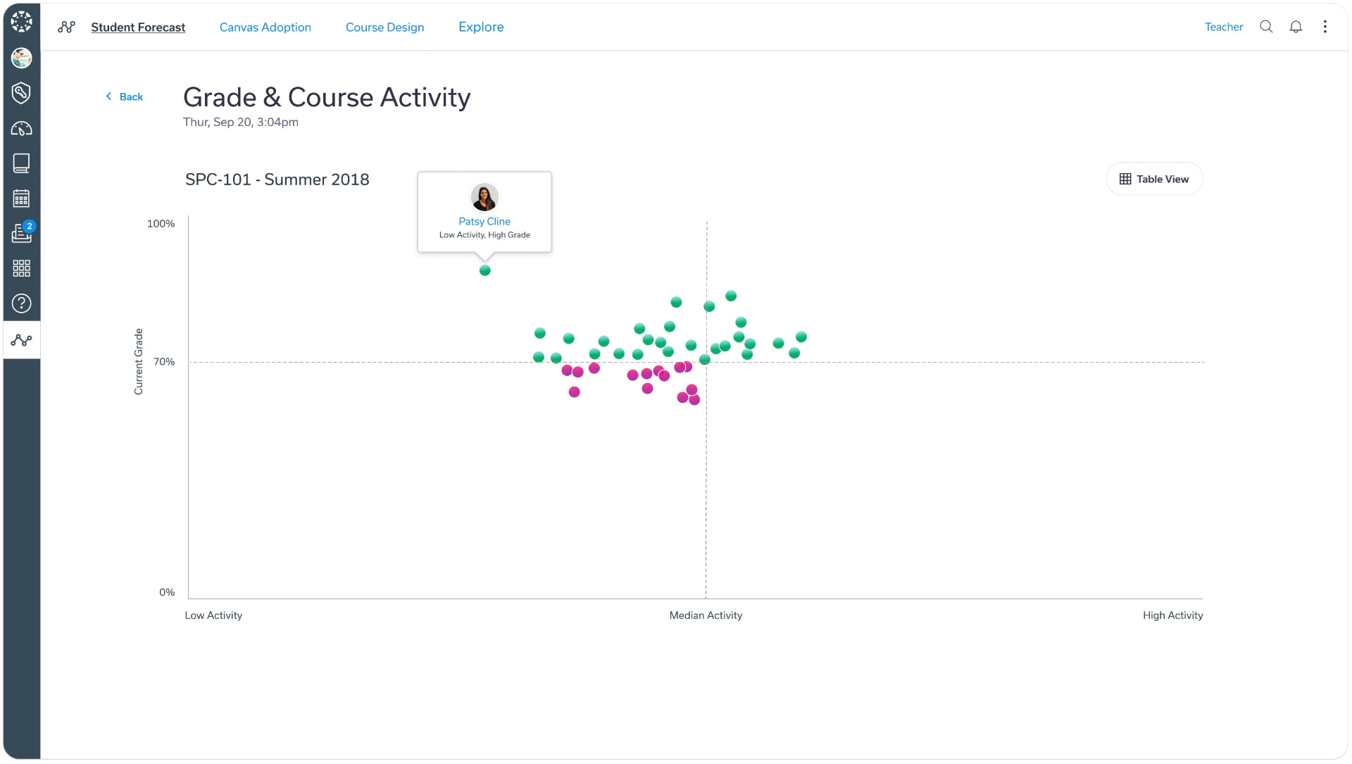
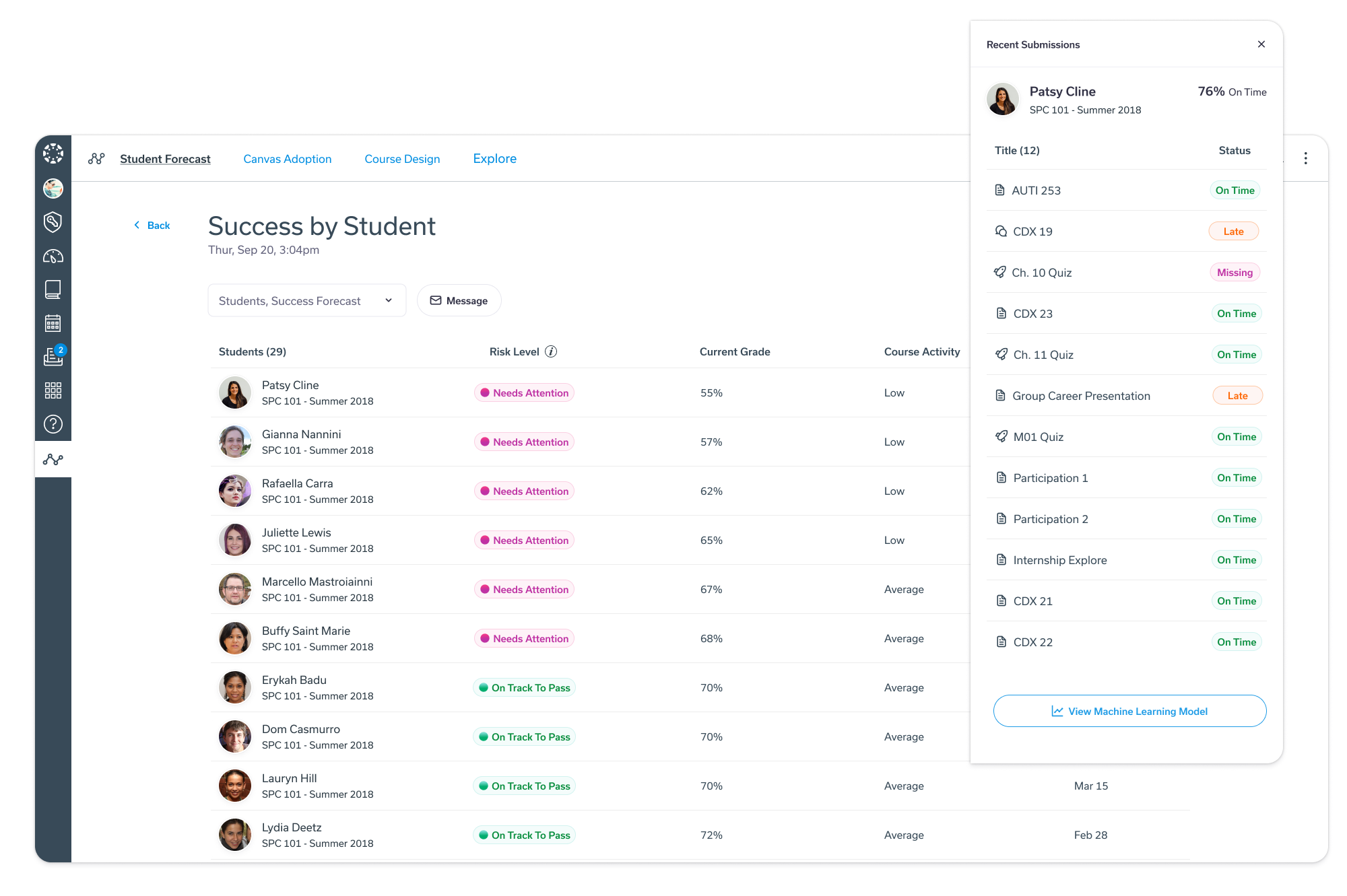
Course and student views. Opening a course shows a table of students, sorted by default so those who need attention appear first. Clicking a student shows their most recent assignments, with messaging placed prominently so the natural next step is reaching out.
Progress over time. A chart shows how the model's confidence band shifts over the semester, so teachers and students can see whether things are improving.
04
Outcome
Pilot schools were genuinely excited about Student Forecast, and we ran trainings for three of them. Teachers and students alike understood and liked the progress chart. After Instructure was acquired in 2020, the project was shut down before a wider launch.