Intermission Health
Honed the brand and redesigned the landing page, cutting CAC from $30 to $11.
- Role
- Founding Designer
- Timeline
- March 2026 – Current
- Team
- David Jimenez, Matt Mills, Katy Monson, Todd Fisher
- Platform
- Naming, Branding, Landing Page, Consumer App
01
The problem
Women in midlife are often told their labs look normal when they haven't felt like themselves in years. Intermission is a membership built for them: a 68-marker panel, her whole health record in one place, and a plan from a physician who has read all of it.
The category is getting crowded fast, with menopause telehealth brands and lab memberships all reaching for the same woman. Intermission needed a name, an identity, and a site that felt distinct, earned her trust, and got her to join a waitlist before the product existed.

02
Process
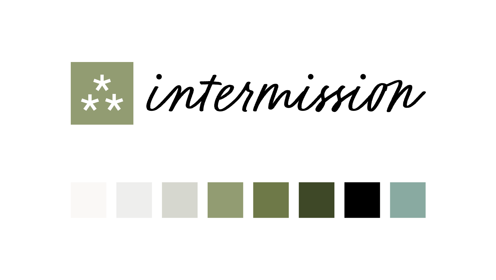
The name comes from the idea that midlife is an intermission. She's in the middle of the story, and often at a point where she needs to pause and prepare for what's ahead. The mark is an asterism (⁂), the symbol novels use to show a break or the passage of time.
From there we tested messaging and visual directions with paid social and iterated on what came back. Two findings changed the work:
She doesn't want to be told she's perimenopausal. We removed almost every mention of it from the site and spoke instead to what she's living with: sleep, energy, mood, relationships.
The brand needed to look premium. Women seeking care beyond what insurance covers have the means to pursue it. We moved the visual direction away from clinical health and closer to the cosmetics brands she already buys from.
03
Solution
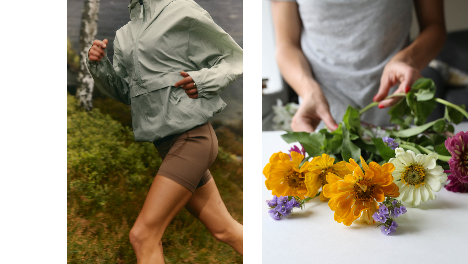
The result feels closer to a skincare line than a clinic, with refined type, a muted sage and stone palette, and warm editorial photography. The landing page leads with how she feels, then shows how simple testing is (book near you, results explained, a plan built for you) and ends with one ask: join the waitlist.
04
Outcome
After the repositioning, cost per waitlist signup dropped from $30 to $11. The waitlist passed 350 women aged 35 to 55 from paid social alone, and 12% paid a deposit for early access before the product shipped.